Untethered exploration, not the book cover :-)
I’ve been working on the design of a cover for an academic book on democracy. It has broad themes like ‘rebuilding’, ‘reconstruction’, and ‘infrastructure’.
One of the central questions it asks is how can democracy be kept alive? How do we approach building a new democracy in this era? How can the many voices and communities participate through civics, action, and protest to be part of meaningful, positive change? And how do the roles of larger institutions—governmental, legal, academic, policy—work to build new, and more effective, systems?
This led me, happily, down a path of abstract, visual exploration. Basic shapes and forms seem well-suited to represent big ideas, like rebuilding our systems of democracy. No matter how strikingly rendered, an image of a flag, thick-columned government building facades, or the Statue of Liberty, would be too narrow a focus. In being too specific, we risk losing the plot. A cluster of shapes, thoughtfully arranged, can elegantly communicate in a way that is more inclusive than specific images with semiotic baggage.
However, when going in an abstract visual direction, that opposite can be true. Without constraints, the abstract can become amorphous, disconnected from a central arc—lost.
In this case, I lucked out. The book title—which I’ll reveal when it’s ready to go public—is ideal. Its two pithy words, each five letters, that stack beautifully, one over the other. And it so happens that the two middle letters of each word—I think I am allowed to say, they’re a V and a W—share a very similar angular geometry
There is so much ‘already there’ in the type. I learned that from Ed Benguiat in his ‘Talking with Type’ class at SVA in 2007. Look at what the letters are doing, where they meet, the negative spaces in between them, and the tricks they play on the eyes.
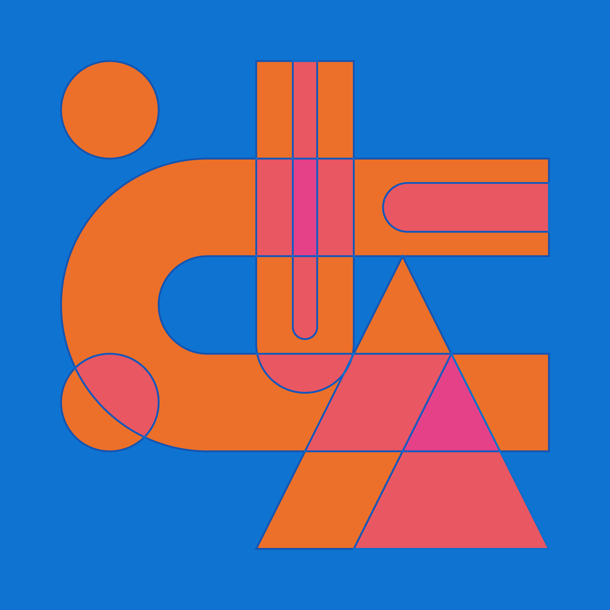
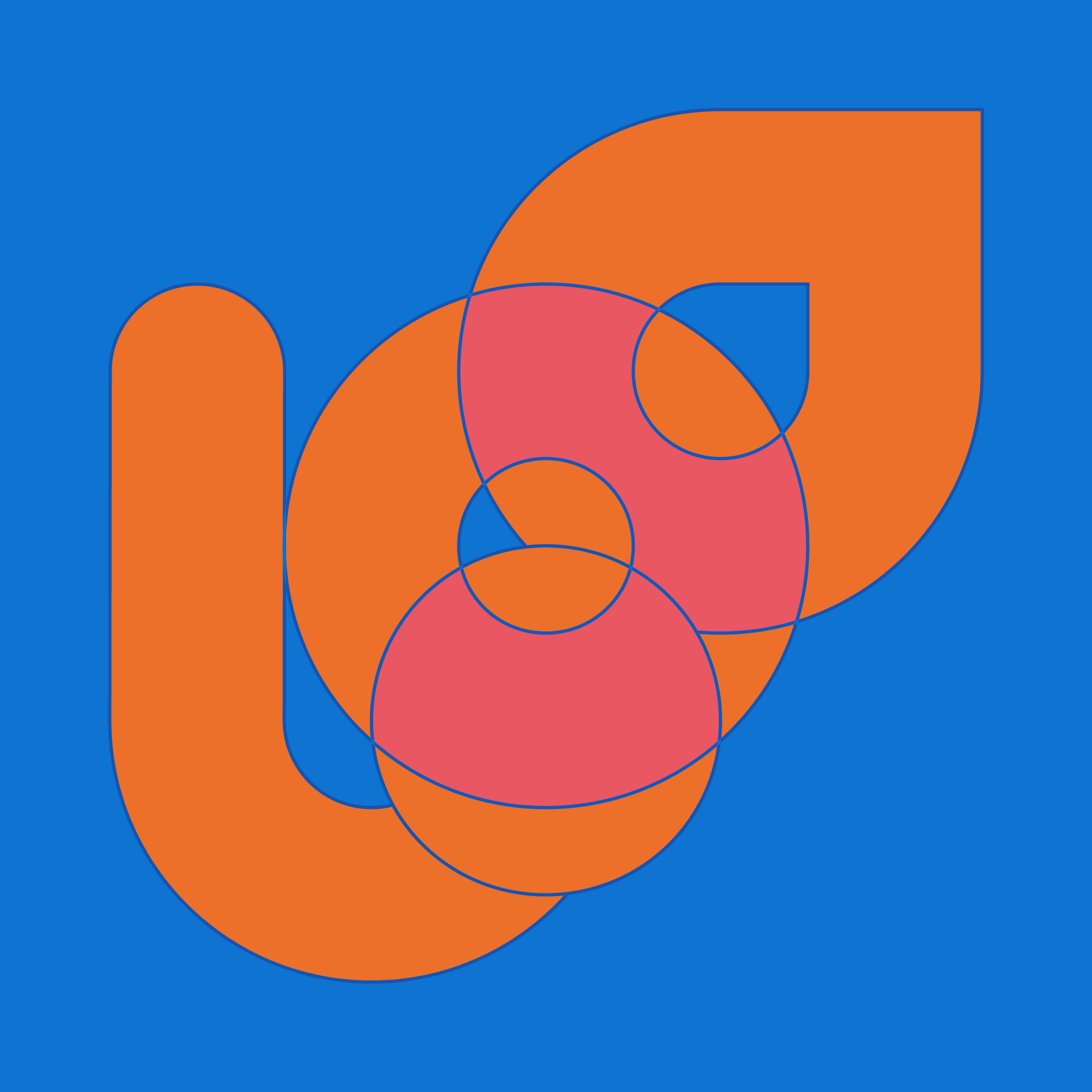
Built-in to the letterforms of my title, with the V and the W are classic, primary shapes: squares, circles, triangles. These all combine to create a satisfying, visual rhythm between the letters.
I decided to run with them: shapes, angles, and all. I made a geometric framework out of the letters, using the built-in shapes they offer, that seeks to convey some of the concepts being emphasized in the book: democratic systems, movement, structures, building, growth, participation. This is a visual language of its own. And because it is extracted from the title itself, the design and title will support each other. Together, they will (hopefully) offer readers a sense of what the book is about.
I can’t show the design (still in the works) yet—though the design process led me to create a grid-based palette of shapes, and a simple set of ratios and rules I’ve applied that allow this to function as a visual system, in and of itself. It can be reconfigured infinitely. I riffed on it for awhile, to the point that it the designs being generated were leaving the conceptual world of the book cover, and entering an imagined world of something else altogether.
I stopped thinking about solving the conceptual problems, and started letting the framework lead the process. It led me down some incredibly fun paths, and over a couple of hours I cranked out the images in this post (and a handful more). Each iteration led me to ask more questions of the framework: what is possible next? What shapes are missing? What does this relationship between shapes and color communicate? What should be different?
It turns out, if we turn down the amplitude in our left frontal cortex (the task-oriented, creative problem solving part of the brain) it may help us dive into a Csikszentmihalyi flow state, which can yield some wildly interesting results—unchained from the output-oriented deliverables that a design brief often requires.
What happens when you switch from problem solving to looking for answers to questions that aren’t being asked?